2025
Nighttime Stroll - Naomi
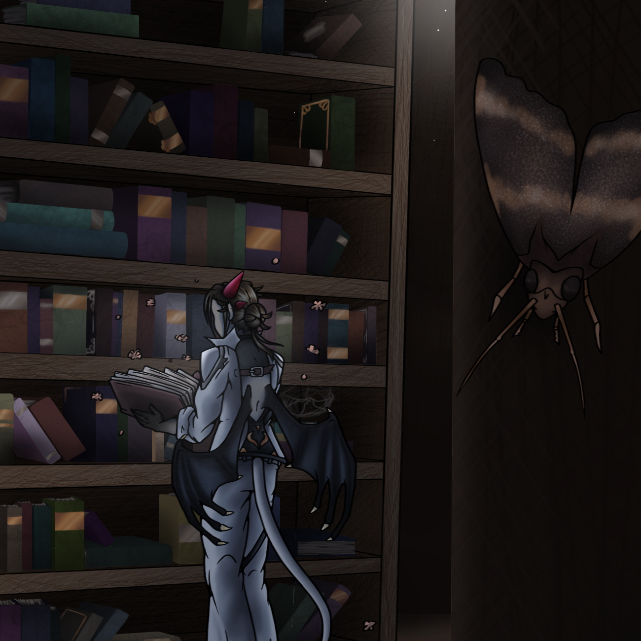
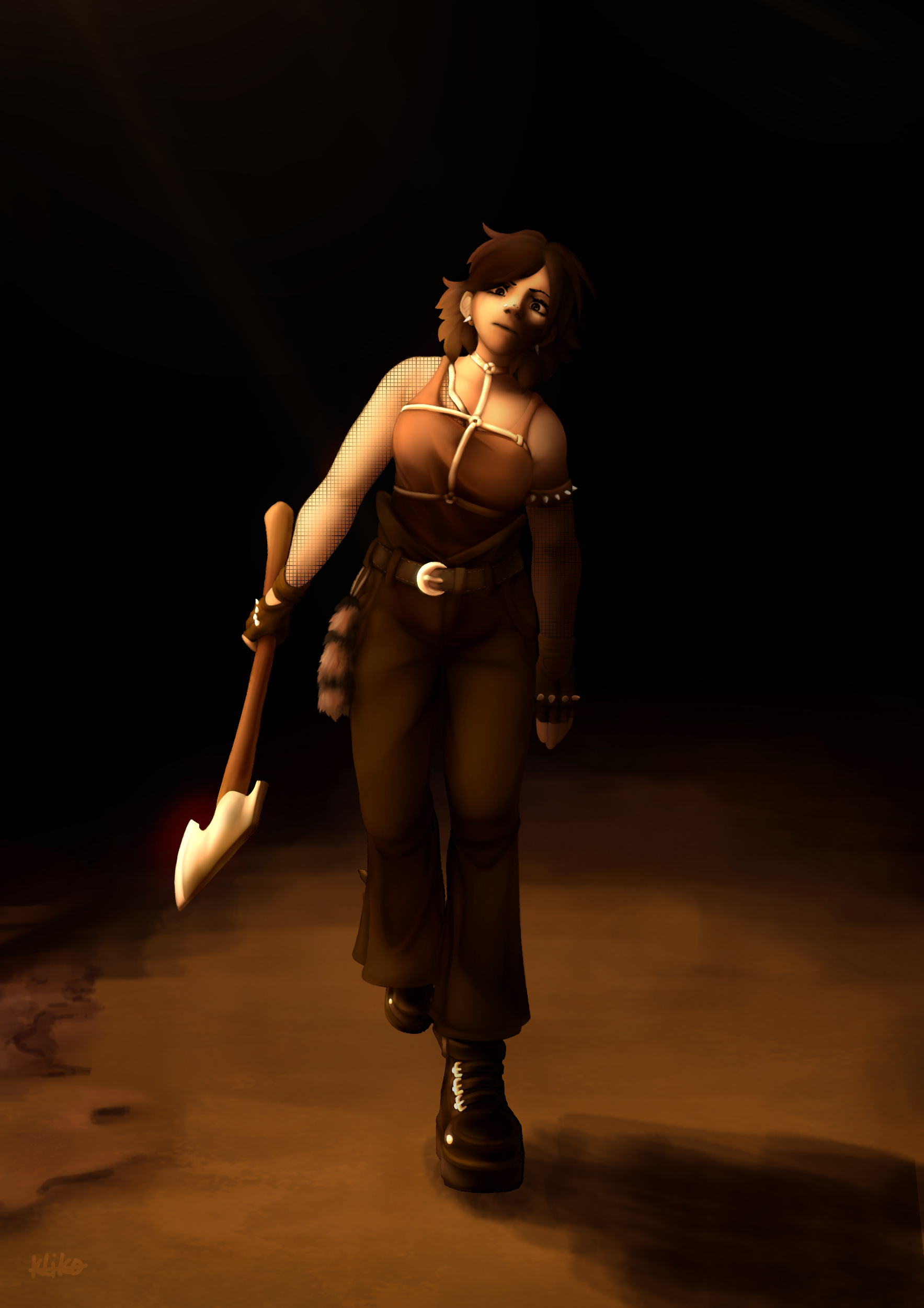
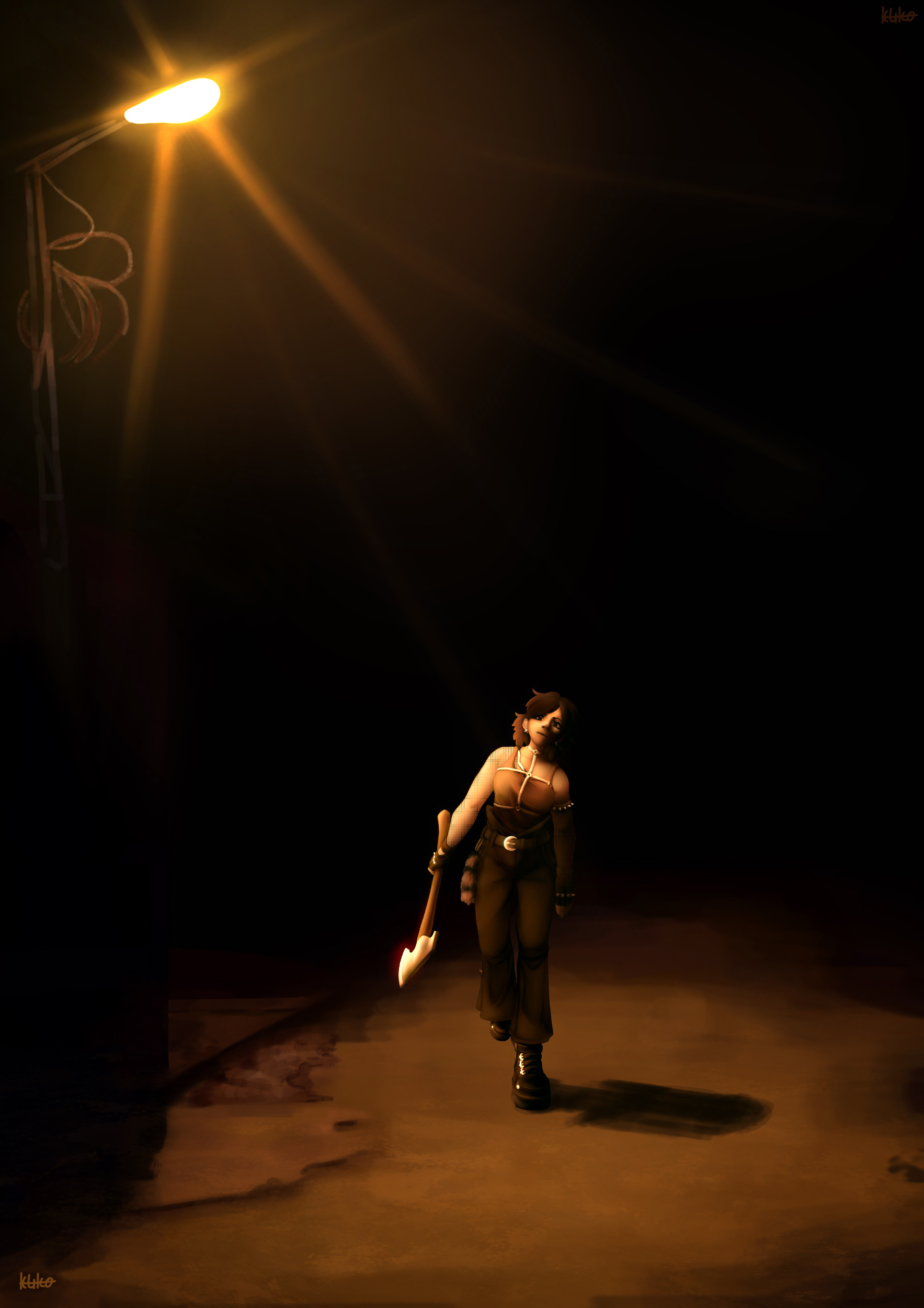
Originally, this work was started around December of 2024, yet I only finished it in January of 2025. The amount of confidence I had in my skills when it came to rendering skyrocketed after illustrating Lady Dimitrescu. Yet, it posed more of a challenge than I realized.
Also trying to paint in an entirely different palette and understanding how the colors collide and compliment together, the nighttime stroll in the lantern emits yellow over her silhouette.
Having been cheated on, Naomi resorted to rather extreme measures. Safe to say, the message she wanted to get across did indeed, get across.
Nighttime Stroll - Naomi (Zoom)
Nighttime Stroll - Naomi

Sophisticated Sachrei
With a more unfinished, paint-like style, I tried to imitate 19th century artwork. By using colors that are in much contrast to one another, I created a vibrant environment that complimented each other.
Sachrei has from the start always been a king, and therefore was the most fitting character that I could use.
Vulnerable
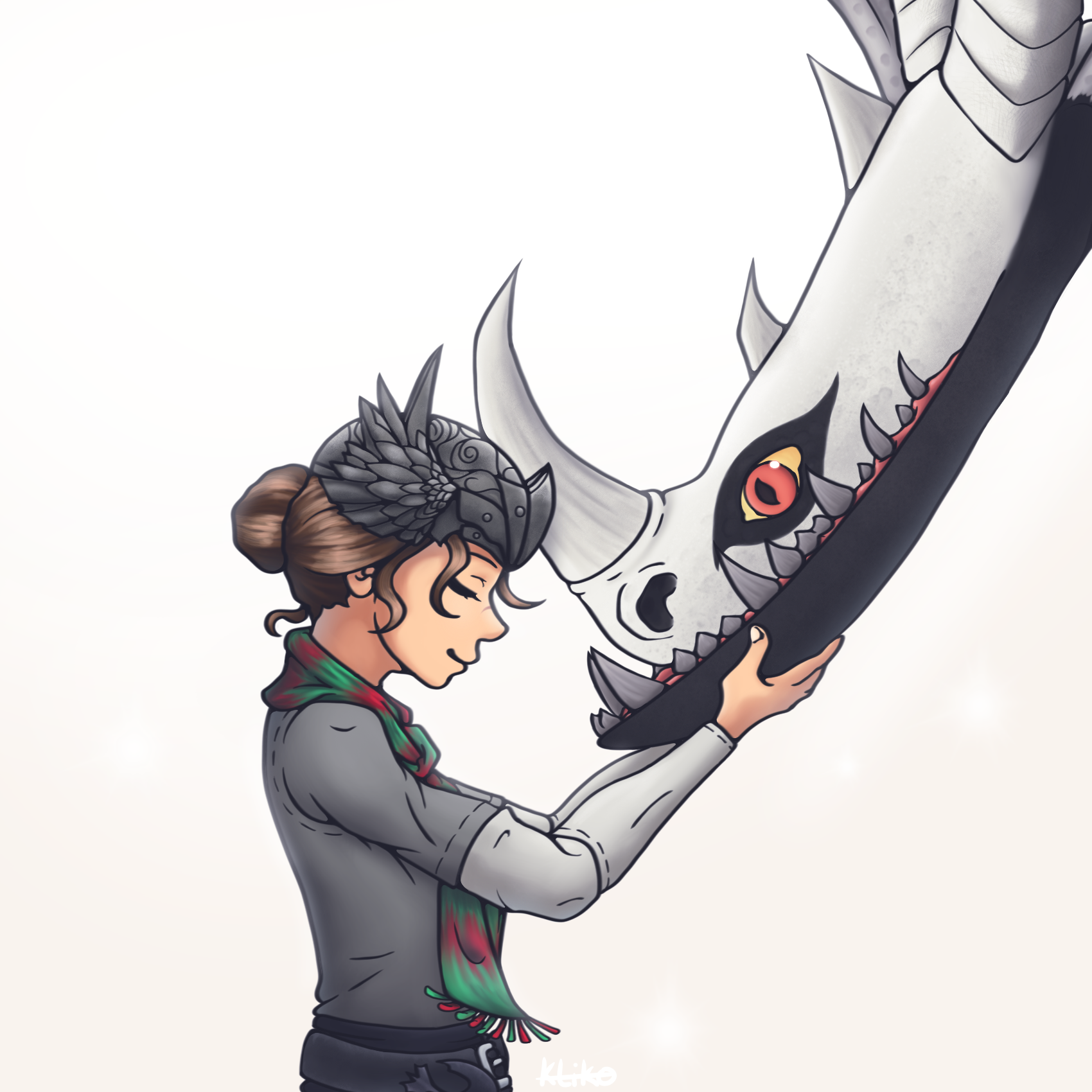
Talon has always been a favorite of mine. With particular aspect I still struggled with, such as perspective on the face and how its elements are affected by tilt, and the movement of the belly. Light was also a struggle. To play with it, I had the shadow and light layer be completely filled, after which I erased parts of each that would cover the opposite (the light layer had part erased on the shadow layer and the other way around).
I did not only choose the most common complimentary palette, but did so to associate more with colors from a certain country and its past. To also add hints to his past, I tried to replicate the structure of walls that you would see in the temples.

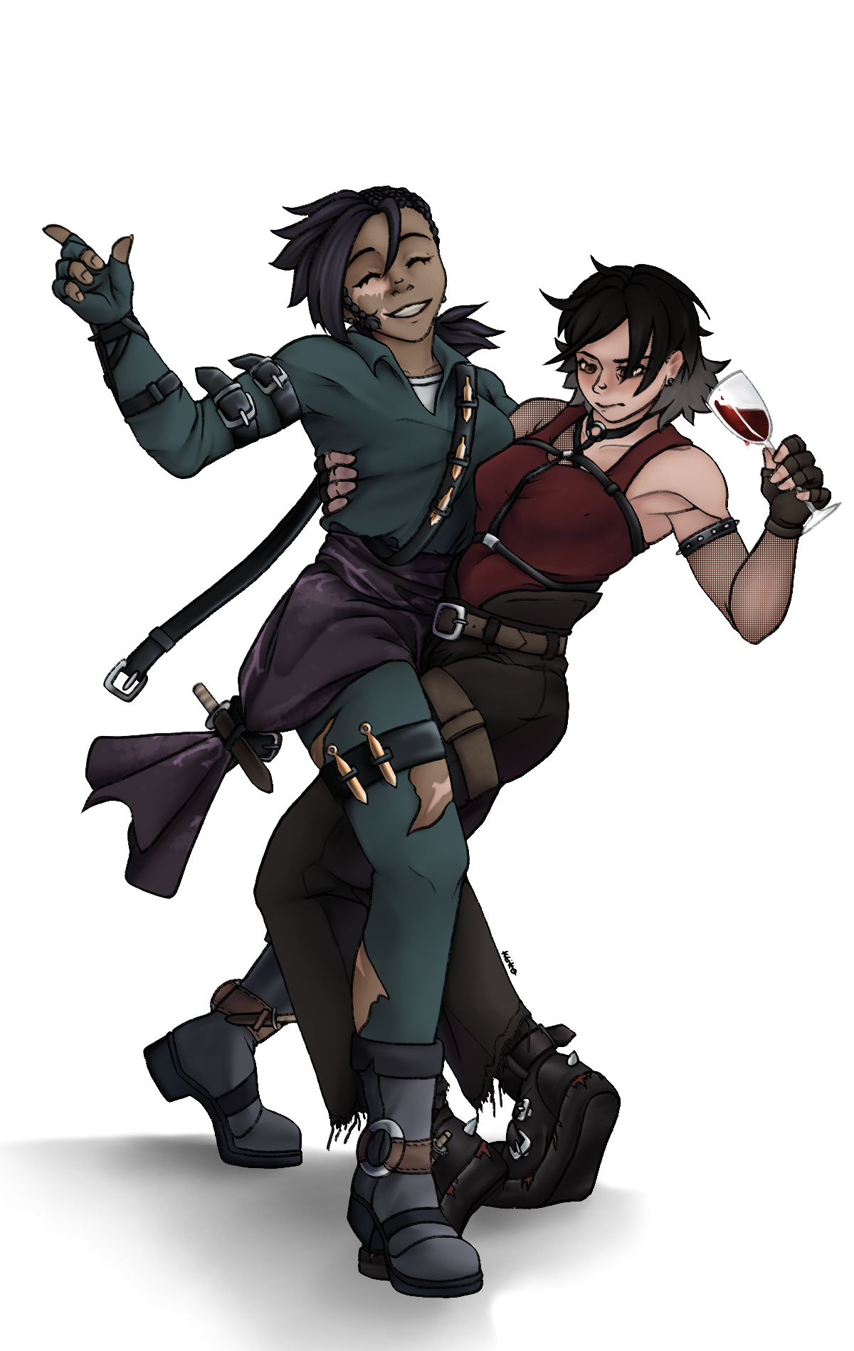
Rim & Talon
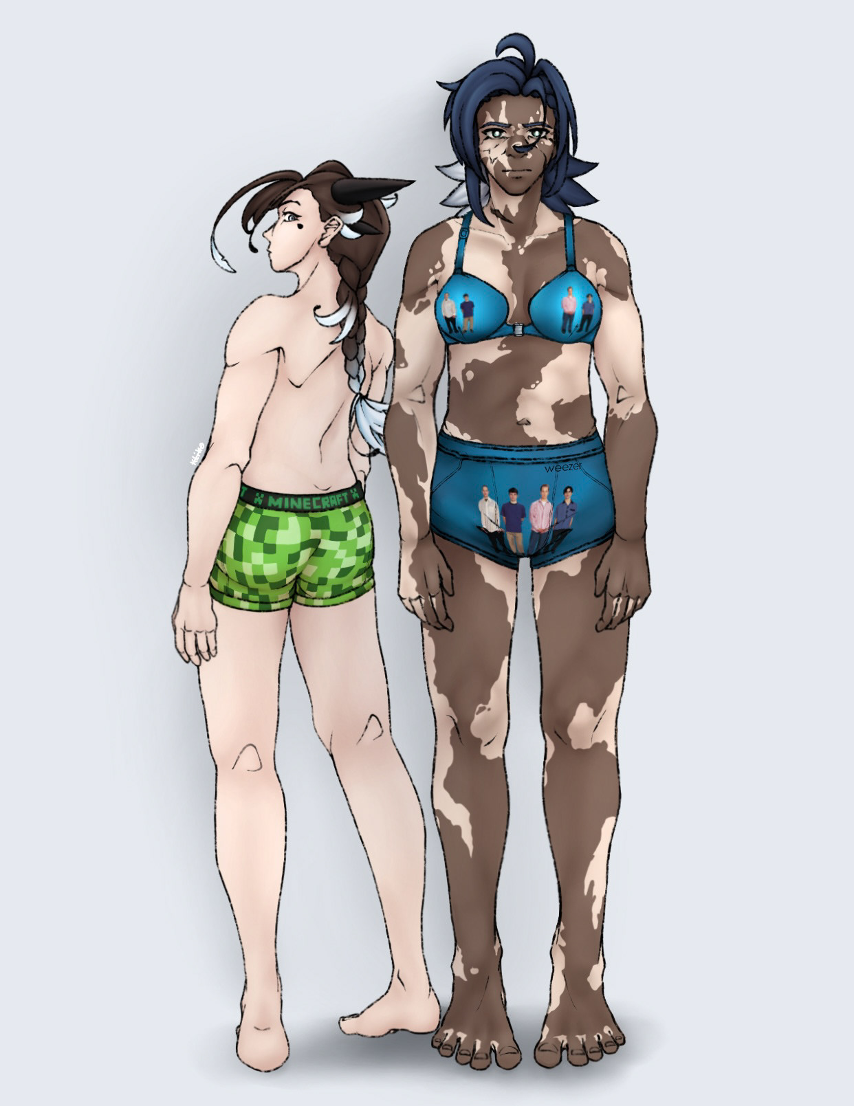
Minecraft & Weezer
Being actually paid after bragging about finishing the illustration, the Weezer and Minecraft underwear was immortalized.
Using an earlier sketch of Rim I had made in my sketchbook, her pose was finalized fairly quick. Though Talon was completely made from scratch, and I hit some roadblocks trying to perfectionist the anatomy of the male body. Despite all that, the shading went smoothly, and I was able to properly mark parts of the anatomy such as the muscles that are visible through the skin when an individual is either swole or unhealthy skinny.
Using darker and saturated tones to line out important parts of the bodies instead of the line work itself brings out a more realistic effect and prevents the work from looking too clustered.
2024
Blockstarplanet 10th Anniversary
For the tenth anniversary of the online-multiplayer game Blockstarplanet (Msp Aps) my idea was to show my gratitude to the developers and player base by drawing a large illustration. This illustration consists of not only the characters in the game, but also some of the original characters of the players, whom I had personally asked to submit their persona's. To represent the game's wide range over countries their players are from, I scattered traditional dishes from said countries over the table.
The illustration was also featured on a wall as a print, for all bypasses to see. I had submitted it myself and was most surprised when passing by on an afternoon, Seeing your art on display is certainly something.

10th Anniversary of Blockstarplanet (2024)
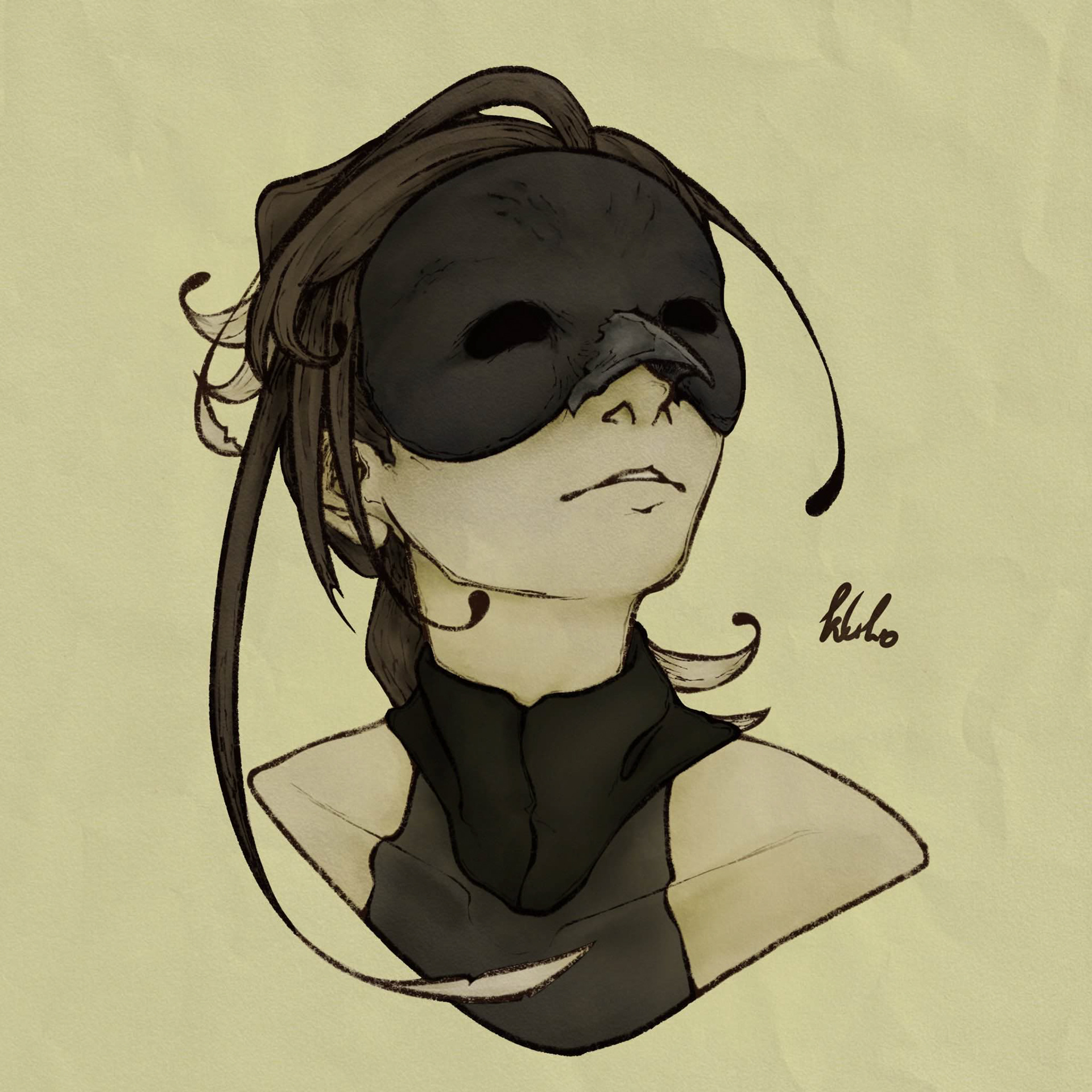
Rim (Harpy Hare) 2024
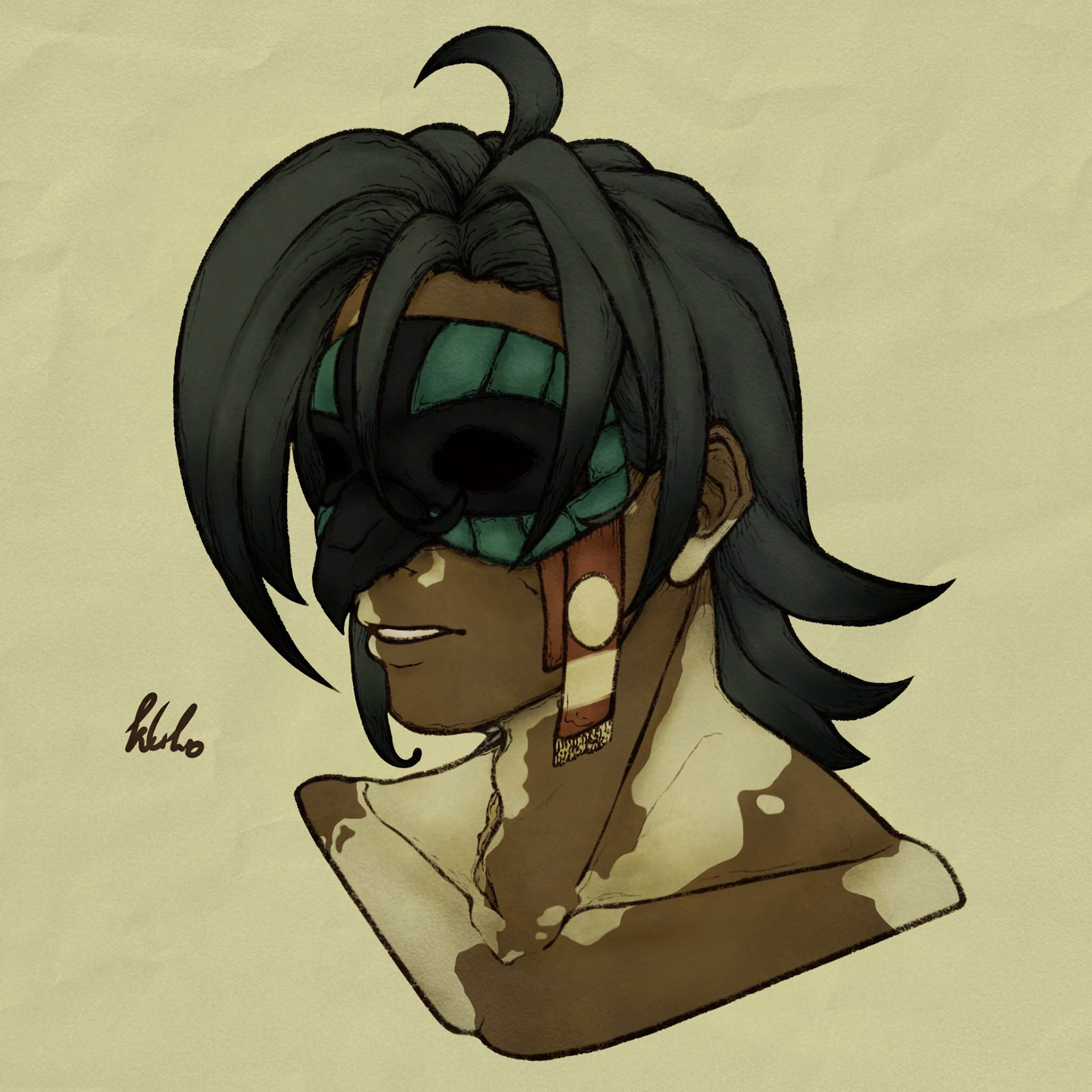
Talon (Harpy Hare) 2024
Rim & Talon
inspired by Yaelorke
Through careful observation, I moved my characters' regular colors to the more yellow and green saturated area. Where artist Yaelorke would present the color of their character as blue, the color was actually a greener tone. Figuring this out for Talon was a greater challenge, due to his blue hair and colorful mask, inspired by the Aztec God of War and the Sun; Huitzilopochtli.
Lady Dimitrescu - Victorian Garnet
RESIDENT EVIL: VILLAGE
After discourse was sparked on a game modifying program, with the aid of references, I worked on this illustration of the 9ft Lady to represent her as ethereal as she is, aside from the unquenchable thirst of blood which she has in the Resident Evil game.
Unlike with an earlier work of mine, I used line work for the character. After the work on the body was done, it served as underlay for the rendering of the lines. With a pen, carefully were the lines colored over and smudged. This created a more realistic effect, along with the draping lingerie. As final touch, a layer of shadows was overlaid on her silhouette.
Lady Dimitrescu - Dark (2024)

Lady Dimitrescu - Light (2024)
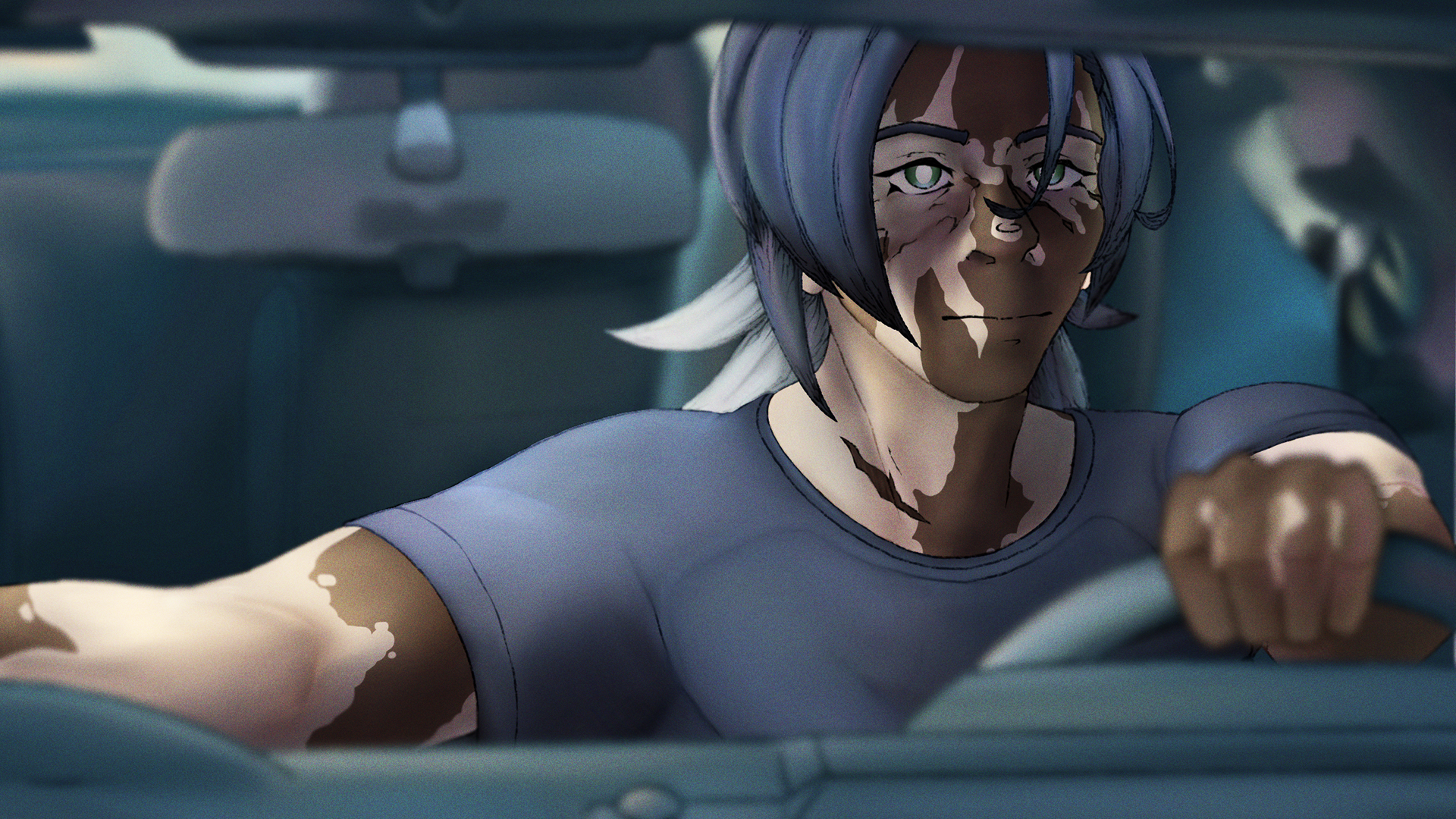
Talon (Ryan Gosling - Drive)
A test of vibrant colors to resemble the original frame as much as possible. With the help of multiple software, an attempt to create an immersive illustration was made. This work was also a further step in the combination of rendering without lines and the use of distinct black lines to still capture the form of Talon.
Falin - Chimera
Dungeon Meshi
To challenge myself with rendering, the decision was made to not make use of line work this time. Her feathered chest was certainly something to complete, but by making smudges instead of going for distinct shape, it created a far better effect than if I had went with lines. In contrast to the fluffy feathers, the skin is defined with proper shapes to remark the anatomy.
To add; I specifically wanted to have one version for this illustration, to exhibit the monstrous side to the character which she shows during the running of the episodes. But to savor my hard work on the anatomy, I kept the version that would be suitable for other audiences.
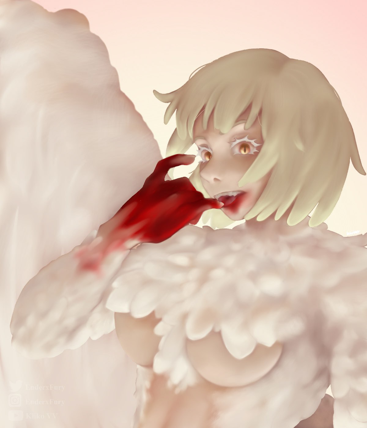
Falin (blood) - 2024
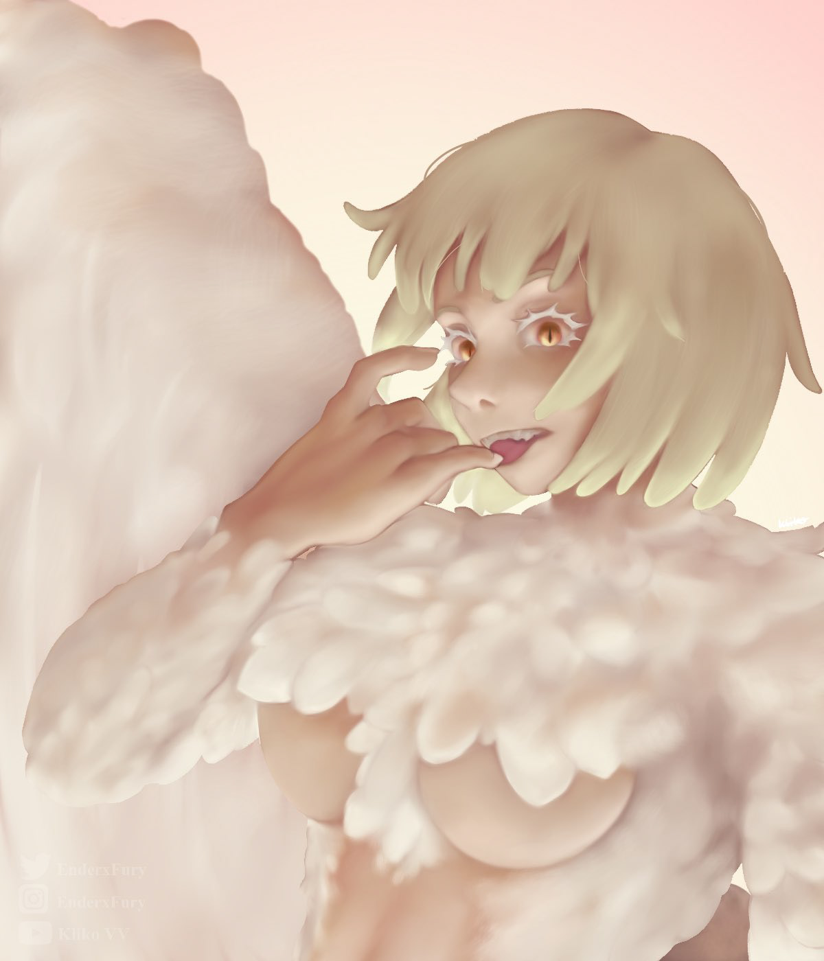
Falin - 2024
Gladys & Naomi
Their relationship playing a major part in my story on grounds of morality and love, Gladys and Naomi are polar opposites on some grounds. Trying to express this, I gave them not only brand new, updated designs in contrast to one another, but also made an illustration showing the contrast in personality and habit.
While Naomi attempts to drink her sorrows away, Gladys focusses more on being with people she appreciates. Even if those people loathe her.
Besides the colors, their clothes are a classic complementary palette, girl in red and the girl in blue. Naomi's red expresses her quickly agitated personality, while Gladys' is calm but easily overwhelmed.
Bun - Rim & Sachrei
Striving to test a new type of illustrating different types of texture, I put them in latex suits. Yes, those. To get a point across that the latex suits aren't inherently sexual as well.
The latex was a challenge to illustrate, as I had never practices with the material before . Yet the final result was pleasing, and I got to present my characters in a different manner that is to be interpreted by the audience. My goal is to show no one has to be ashamed of the way they look, hence I wasn't afraid to illustrate Sachrei's scars.

Rim (Bun)
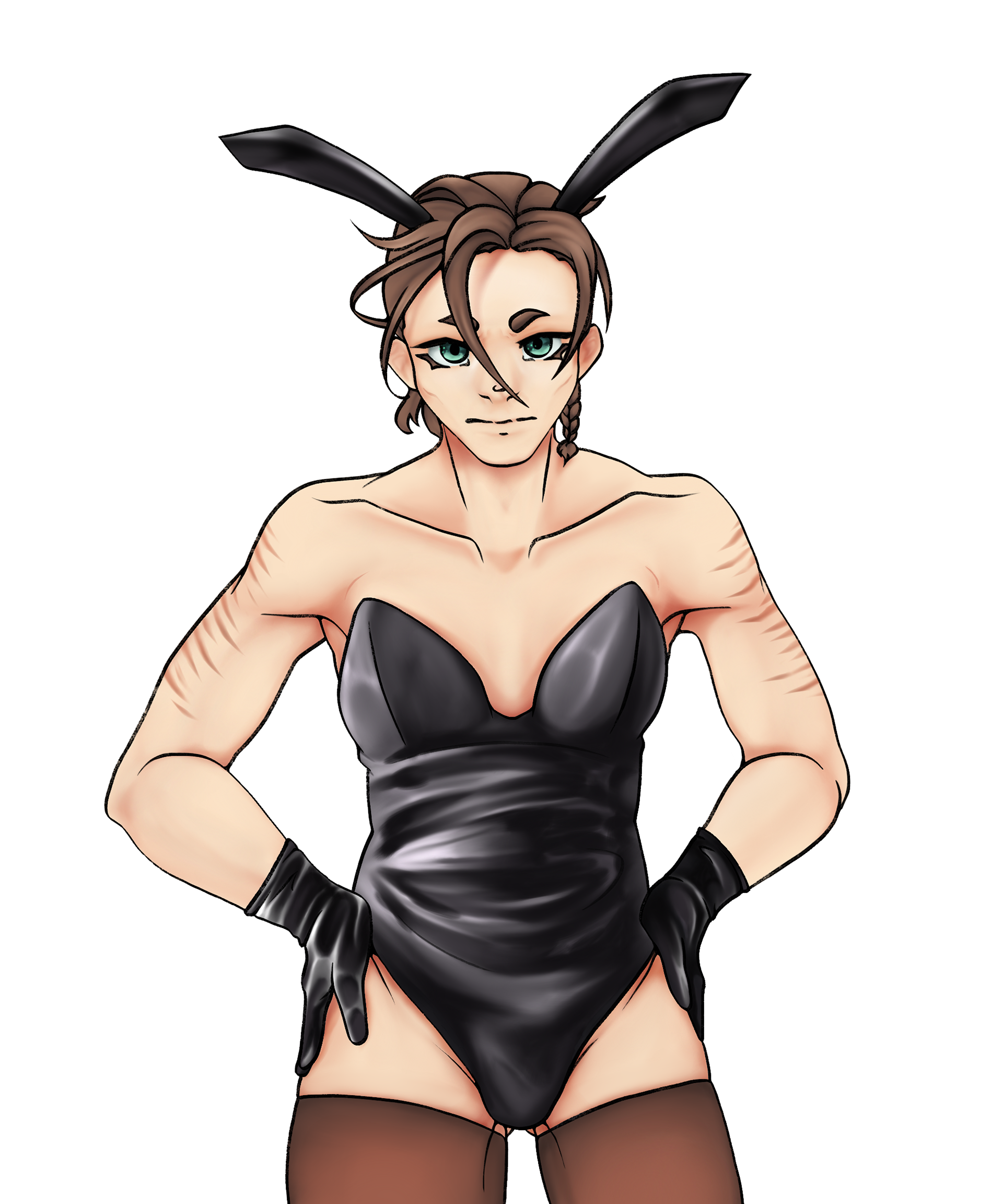
Sachrei (Bun)
May - Min4cious 70k DTIYS
In February of 2024, an DTIYS (Draw this in your style) was organized by an artist I look up to. For this competition, I drew their character, May, to take part. I made use of several software, this being Photoshop and Sketchbook. It was a challenging perspective to pull off, but regardless, the finished product turned out to my liking.

Resident Evil Village - 2024

Resident Evil 4 - 2024

Resident Evil 4 - 2024
Resident Evil 4 - 2024
Resident Evil 2 - 2024
Resident Evil - Kliko
For Youtube streams stretching over the span of multiple months, I designed thumbnails to capture the atmosphere of the Resident Evil games. To further insert myself in the game, I replaced the main character in each game with Kliko, my character brand.
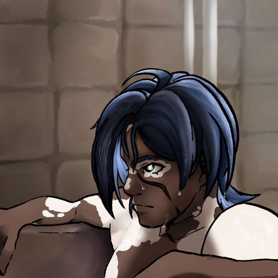
Talon (Bath)
Working with large Wacom screens and computer pens, and with the use of a reference, I got to test out the broad possibilities of Photoshop. With the knowledge I already had regarding illustrating characters, I specifically chose Talon to see if the brushes I had within my reach could amplify his appearance and make him, with my skill, more real, despite being 2D.
2023
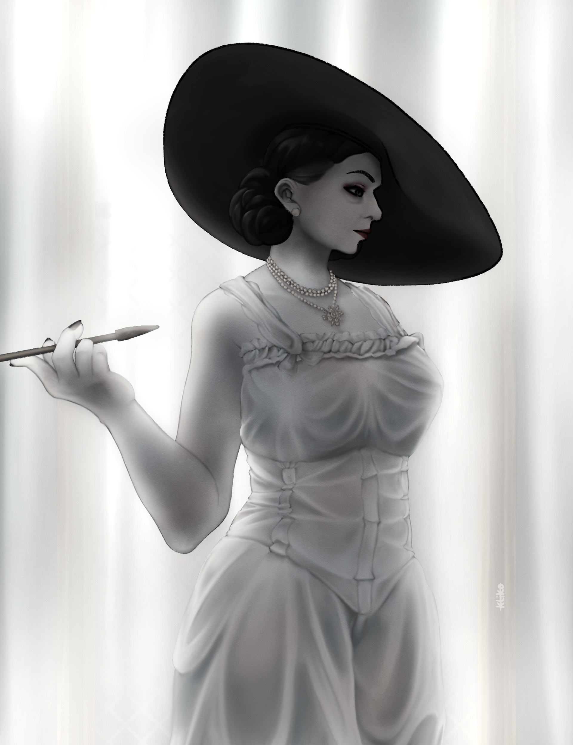
Fleur - Raffle
Celebrating a milestone, I held a raffle for my following. The winner would receive their character illustrated in a bust. Using the soft lineart that takes different shape depending on tilt, I illustrated Fleur's character. She was very pleased with the final result.
At the end of the illustrating process, I noticed the character's head was a bit too oversized, and used the software Photoshop to fix this.
TV Girl - Rim & Talon
As reaction to a trend, I was inspired by the famous album cover of TV Girl: Who Really Cares. Having to process my characters' design in a blue and pink color palette, while also blocking out their forms was a challenge, and I am pleased with the result.
TV Girl's music has always been a source of inspiration for me, whether it be for their album covers of music itself. In August of 2024, I had the amazing opportunity to see them preform live in Amsterdam.
Rim - Billie Eilish
Obsessed with the Happier Than Ever album by Billie Eilish, the idea was made to draw a character which I considered having a rather close relation to the lyrics in the songs be the replacement in the spot of Billie, to recreate her photograph as close as possible and capture her pose.
My best effort was made expressing the vulnerability of my character Rim, in a way that could not just represent the character, but also myself.
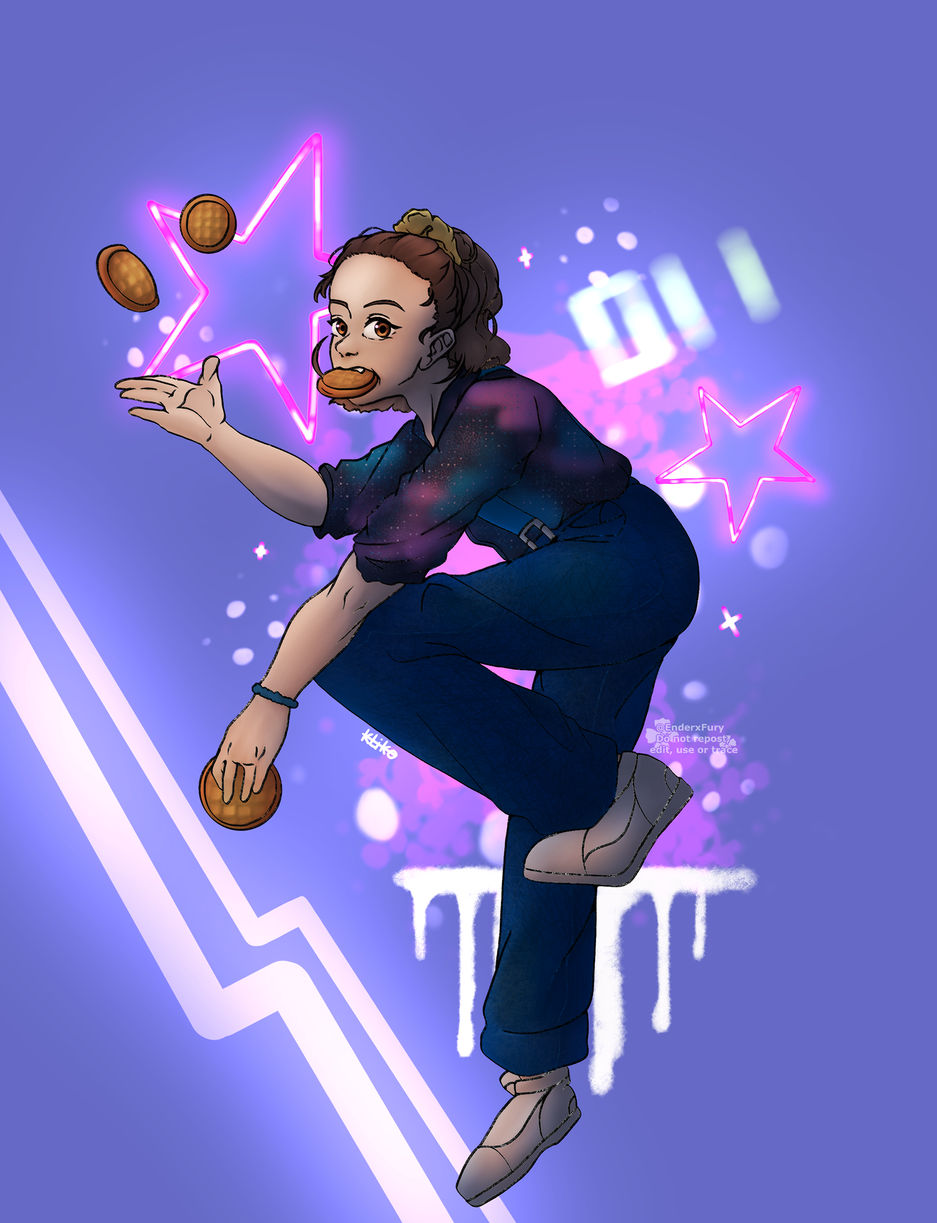
011
A full body illustration of 011 from Stranger Things. To test a new type of rendering, I had blocked out all shades in greyscale, and then colored over with the appropriate colors to match her looks in the third season specifically.
In the show, she has an overwhelming love for a waffle brand, therefore I included these waffles, which she is letting levitate around by using her telepathic abilities.
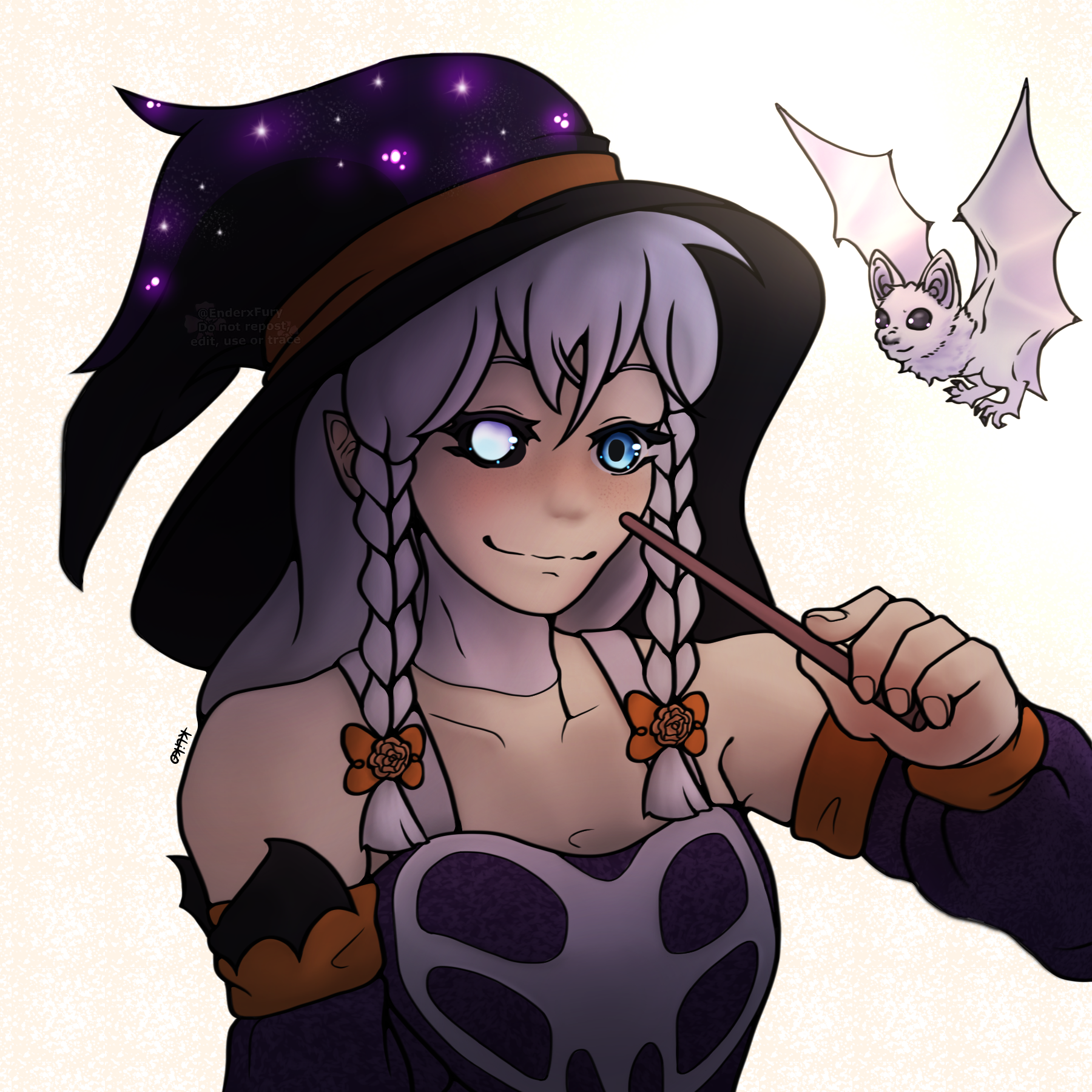
Samhain
Having seen a fun character design to illustrate, I went ahead and worked out the looks in the way I interpreted them. To challenge myself further, I decided to go ahead and attempt a greyscale artwork, in which all shadows and light sources would be blocked out before adding hues to it.
In the spirit of Halloween, the character's name became Samhain, as they were featured on a blog post and weren't a commercial character, nor belonging to a copyrighted IP.
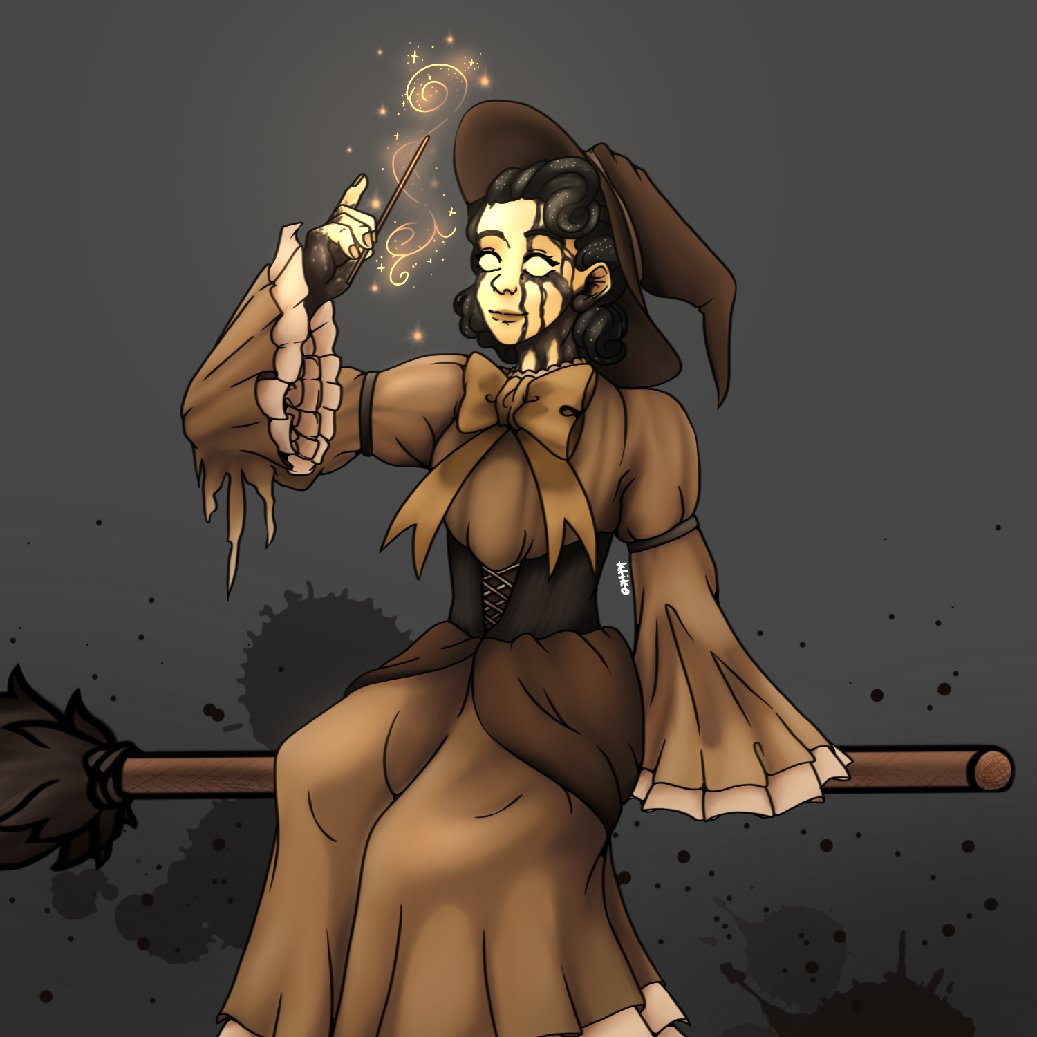
Audrey
Bendy and the Dark Revival
For a challenge sen out by the official Bendy account, I put my current projects aside to draw this fun idea. My interest in the game franchise has made me a Lon fan, and I wanted to do the main character of the newest game justice.
As the game plays in the 1950's, I aimed for this authentic dress look that'd be appropriate to a witch. Long, draping clothes cover her arms and legs, to really show off this mysterious individual.

Kuro - Raffle
My first milestone had me motivated to host an art raffle for the people who supported me to reach the goal. The lucky winner, Kuro, received their character colorfully illustrated, with bright shining lights behind the character. The way I rendered the character's face made them look especially soft, and I am personally of the opinion that I illustrated the face shapes very well.
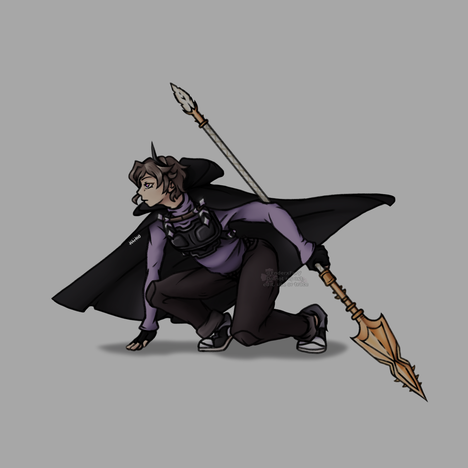
Bei - Fullbody Illustration
During the course of the story, Bei is tasked to track and hunt down his former friend, who has been conspiring and influenced by an alleged murderer. He is granted a brand new spear and armor for protection by the king, and embarks on the journey with a selected group of capable individuals.
His brand new look had to be both able to wear comfortably and light, which I illustrated to my taste, being influenced by many films starring SWAT, police and other military themes.

Socks
Socks is depicted trapped in an aquatic cage, sold for a large amount of yen. I aimed for both environmental storytelling and an aesthetically pleasing illustration.
Socks is an overdose with traits of that or a shark, fox and goat. He spend most of his life being transferred around Japan to be sold. Overdoses are rare, and worth loads of money. During all the transferring, Socks got separated from his sister and has not seen her since. Eventually he meets Audrey, who intends to free him from being a product on the black market. Audrey takes Socks in and is now part of Alex’s organization which aims to eradicate discrimination against lighters and overdoses.
It was also a challenge of perspective, as he is viewed from higher up, instead of from the front. To further illustrate the story, I had the water tank look overgrown with algae, and to show some sign of neglect.
School of Dragons Tribute
As the saddening news that School of Dragons, an online multiplayer game based on the successful franchise How To Train your Dragon, was going to shut down on June 30th 2023 was announced, I paid one last tribute to all the time I had spent with virtual dragons. I had grown exceptionally attached to them, despite having not played the game in a long time.
My two favorites are illustrated right here. The first image also features my character's look in the game, accompanied by her dragon.
Slithersong "Bendy"

Triple Strike "Apple"
Rim - Dainsleif
Genshin Impact has always been a source of inspiration to me. The character designs have this insane effort put into them to be as visually appealing as possible. Using a reference of the character Dainsleif, Rim was the character I wanted to present myself as, essentially cosplaying him.
The lightfall on her body allowed for this shine to scatter over the image, having it light up the environment and emit a faint glow on pale surfaces.
Rita Blasta - Art Competition
For an art competition hosted by Blockstarplanet on both their official Instagram and in the online multiplayer game, my idea was to illustrate one of their iconic characters, specifically Rita. Her personality is very extroverted and competitive, and therefore the elements of a space gun and the portal which leads to the battlefields were added. To further illustrate the colorful environment the game normally has, I used classic colors in a manner in which they would not clash with one another, but rather complement.
I was one of the 9 winners announced on the official Instagram and had also enlightened myself with new techniques to use for illustrating material, light and shadow and architecture.

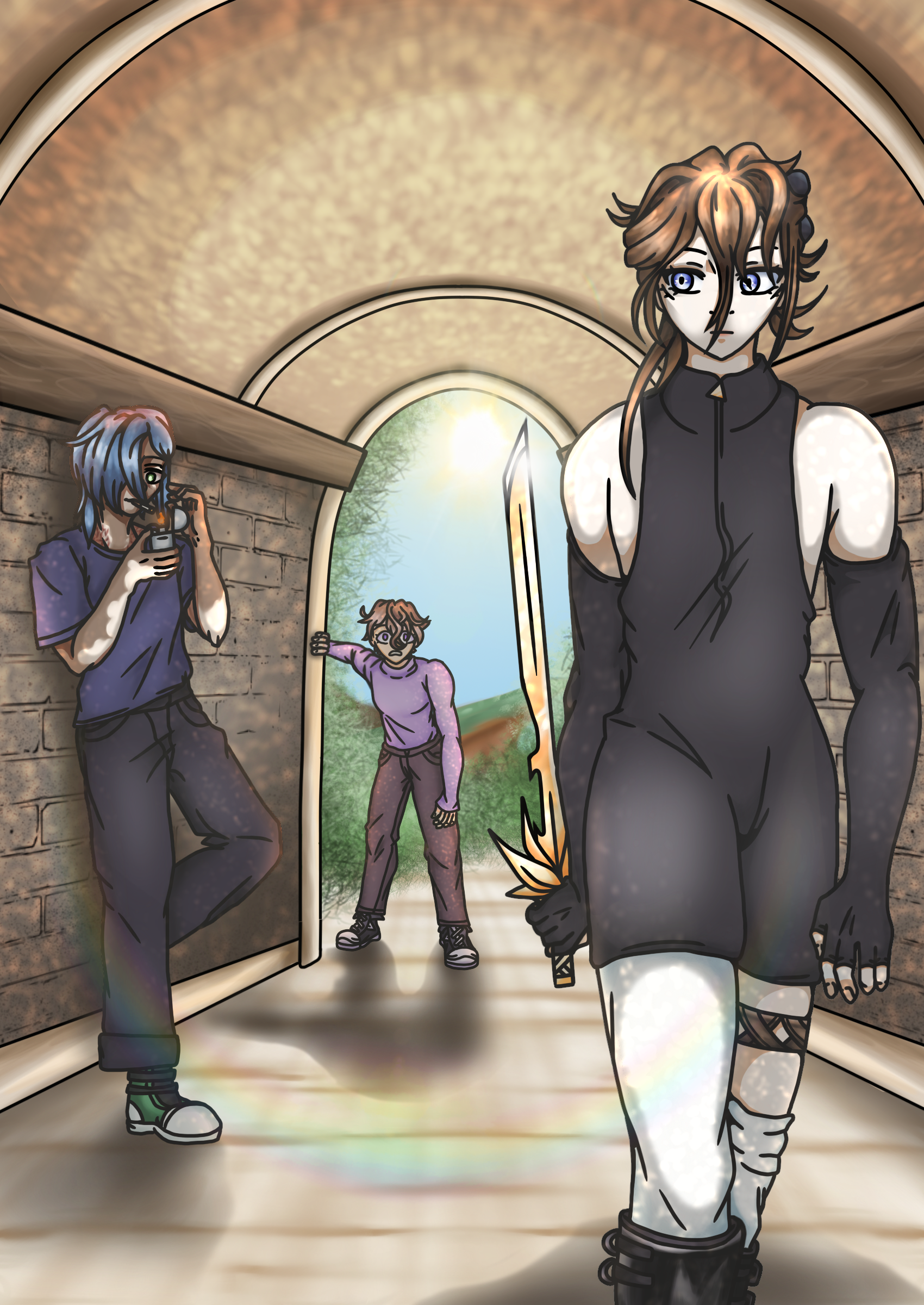
Rim, Talon, Bei
To enter a competition I was signed up for by a superior, I combined it with an earlier assignment in which I'd said that I'd draw the characters for the story I had made up. To show all the main characters, I put together this tunnel composition in which they all get a turn to be looked at. To further illustrate their personality and roles, I had them illustrated to behave accordingly to it.
My finished work was send to Kadmium in Delft. It was put on exhibit for a while, and during the prize round, I was an honorary mention, namely fourth place.
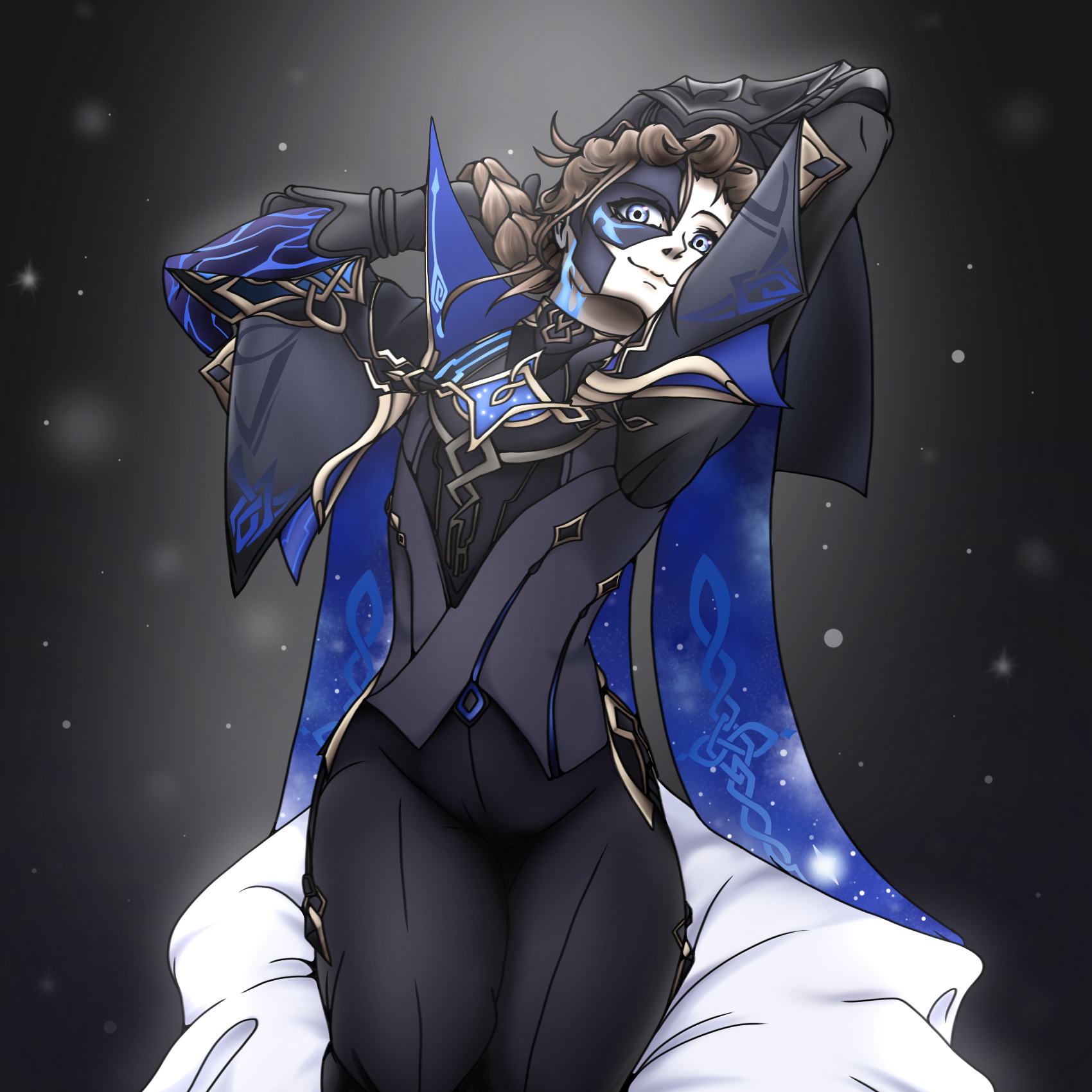
IL Dottore
The heretic Il Dottore is quite recognizable by his blue color scheme and signature mask. After his introduction with his brand new look during Sumeru in Genshin Impact, I spent my New Year's Eve working on representing his blasphemous, crazy behavior. Having a raven motif scattered thorough his design, feathers were one of the elements I added. To ensure he'd come across as dangerous, I made use of a color palette, so the viewer would take the illustration more seriously.